Jawg GIS
Estimated reading time: 10 minutesThis manual explains the Jawg GIS components and how to use them to configure a complete geospatial pipeline.
For integration in your application check out the examples section.
What is Jawg GIS?
Jawg GIS is a web application for managing and styling geospatial data. Use the Jawg GIS to build your own geospatial pipeline and transform raw data to map optimized rendered features.
A typical geospatial pipeline has 4 parts:
-
 Datasource
-
 Dataset
-
 Datastyle
-
 Map
Map
Login to the Jawg GIS
Go to https://www.jawg.io/gis and use your Jawg account credentials to log in.
Your account must have an access to the Jawg GIS. Please contact us at [email protected] to activate Jawg GIS on your account.
Datasource
The first thing you want to setup when creating a geospatial pipeline is the datasource. A datasource describes the location of the geospatial data and its format.
The GIS supports 2 types of format:
On creation you must choose one of these types.
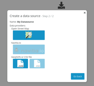
GeoJSON Datasource
After creating a GeoJSON datasource you can provide either the URL of a remote hosted file or upload directly the file to the GIS.
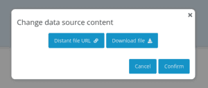
A remote hosted file has the advantage to be updated with new data over time while a directly uploaded file is static and won't change anymore.
OpenStreetMap (Overpass) Datasource
Once the OpenStreetMap Datasource created, configure the interpreter URL and the timeout then click the Save button.
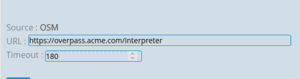
Make sure that the URL path ends with
/interpreter
Publish
When the configuration of your datasource is finished don't forget to publish it

Every resource of the GIS has a draft and published version. The draft version allows you to make changes without impacting the published versions.
Only use published versions in production.
Dataset
The second step in our pipeline is dataset. A dataset defines a collection of models (schema) and the features to import from datasources.
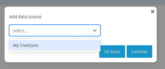
Add a datasource
First, link a datasource to your dataset:
- Go to the Data sources tab
- Click Add data source button
- Select your datasources
- Validate
Create a model
Models defines the properties of the features and the mapping from the datasources.
- Go to the Models tab
- Click Add a new model button
- Choose a name
- Select the geometry type: Point, Line or Polygon
- Optionally add metadata
- Configure the properties of your model. See Properties for more info
- Add and select a datasource
- Define the filters and property mapping. See Filters and Mapping
The mapping and filtering is datasource dependent.
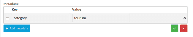
Metadata
Metadata is useful for storing additional information on a model. For example, you can store the categories the model belongs to.
Metadata is not used by Jawg GIS and can be used by your application integration using the get-map-metadata endpoint.
Do not store sensitive informations since they can be public.
You can add up to 50 metadata entries, with key names up to 40 characters long and values up to 500 characters long.
Metadata can be updated even on published versions.
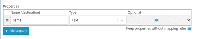
Properties
This section allows you to configure the properties of your models. You can use them to strongly type your models and even make them required.
- Click the Add property button
- Choose a name for your property
- Select a type. Choosing number will try to cast strings to numbers during import
- You can make the property optional. If not checked, features without this property will be ignored during import
Check the Keep properties without mapping rules checkbox if you want to add all other not listed properties during import. This is useful when you want to make sure that some properties exist but you still want all the properties of your features.
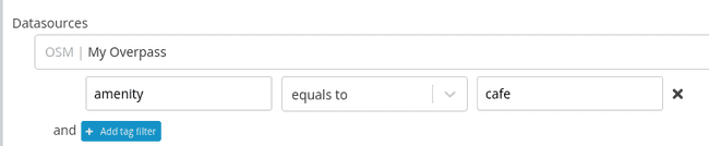
Filters and Mapping
This section adds restrictions on the data of your datasources.
Tag filters (OSM)
Filters the OSM elements by tag. Select a tag on the left then an operator and optionally a value.
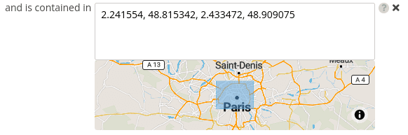
Geometry filters
Geometry filters are useful when you want to import features from specific regions. Supported types are:
- Bounding Box: a simple rectangle area
- Polygon: more complex usage like the administrative boundaries of a city
- Polygons from another dataset: useful when you maintain the polygons in another dataset
Import features
Once your models are setup, you are ready to import the features.
- Go to the Import tab
- Check the datasources from which you want to import the features
- Click the Import button
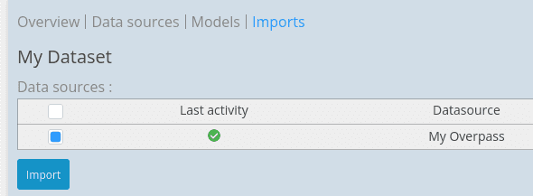
The duration of the import depends on many factors such as the number of features to import, the compute power of the datasource, the number of geometry filters, ...
You should see the report once the import completed.
Making the dataset mutable (optional)
In the Overview tab of your draft, you can make the dataset mutable. A mutable dataset is allowed to import features once published. Otherwise you have to create a new version each time you want to import features.
Datastyle
Now that our features are available in the GIS, we want to render them on a map. There are many ways and rules to render a geospatial feature and those are defined in the datastyle section.
Add a dataset
In the Overview tab you can add a dataset by clicking the Add dataset button on the right. You can add as many datasets as you want and all the models will be available for rendering.
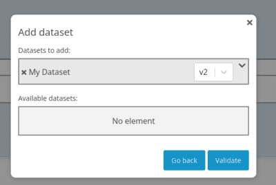
Then click the save button
Create datastyle components
The Display rules tab let you create datastyle components. A datastyle component is composed of 2 things: the data (typically models) and the style rules to apply. Currently there are 3 types of datastyle components: POI, Cluster and Polygon.
When creating any of these types, the first thing to do is to select what models to include. To do so, after creating a datastyle go to the Data tab to select the models.
POI datastyle component
Use the POI datastyle component when you want to display point geometries with an icon.
- Click the Style components button and select POI
- Edit the name by clicking the pen icon
- Go to the Data tab and select the models you want to display with an icon
- Adjust the zoom range of the tileset
- Back to the Style tab you can now configure the style options
- Adjust the style zoom range. The style max zoom can be greater than the tileset max zoom (see overzooming)
- You can enable icon collision. If checked, the icons won't overlap anymore.
- Choose an icon mode. The default is one icon per model. But if you are familiar with your underlying data, you can apply an icon to a specific property.
- For each model (or property) assign an icon
At this point only the default-pin icon should be available. To add your icons click on the Icons tab then click the Add icon button. You can add one or mutiple SVG images at once. Before the upload you will be prompted to choose the icon anchor. For example a pin icon should select bottom as anchor while a circle icon should select center.
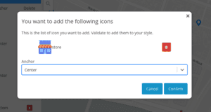
You can now go back to your datastyle component and select the icons for your models
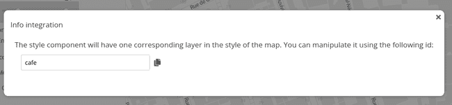
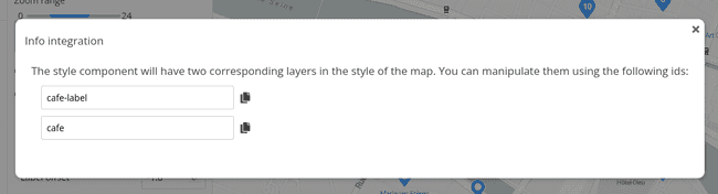
The style generation will create 1 layer:
- A
symbollayer named{name}
Click Info integration to show the layers name
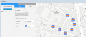
Cluster datastyle component
Use the Cluster datastyle component when you want to display a large amount of points without overloading the map.
The clustering process use a grid-based algorithm to group close points.
- Click the Style components button and select Cluster
- Edit the name by clicking the pen icon
- Go to the Data tab and select the models you want to display with a cluster
- Adjust the zoom range of the tileset
- Back to the Style tab you can now configure the style options
- Adjust the style zoom range. The style max zoom can be greater than the tileset max zoom (see overzooming)
There are 2 types of styles: circle and icon
Cluster circle style
The circle style draws circles on the map with the number of points in the cluster.
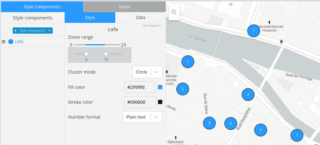
- Select the Fill color e.g. #ffff00, rgba(255, 255, 255, 0.5), blue
- Select the Stroke color e.g. #ffff00, rgba(255, 255, 255, 0.5), blue
- S Select the Number format: for now only
Plain textis supported
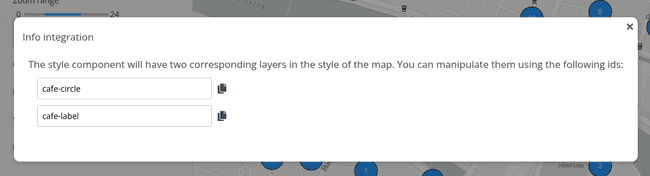
The style generation will create 2 layers:
- A
circlelayer named{name}-circle - A
symbollayer named{name}-label
Click Info integration to show the layers name
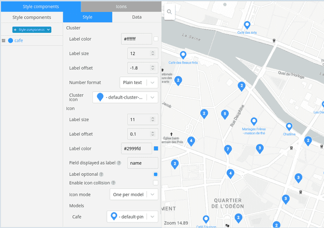
Cluster icon style
The icon style draws clusters using icons instead of circle. This allows more customization and adds the ability to use a different icon when the cluster count is 1 as well as rendering a label.
The first part configures the cluster i.e. when the cluster count is greater or equals to 2:
- Select the number Label color
- Select the number Label size. Units in pixels
- Select the number Label offset from its icon anchor. Note that the offset is relative to the label size. Units in rems
- Select the Number format: for now only
Plain textis supported - Select the Cluster icon
The label position strongly depends on the cluster icon. If you change the cluster icon, it's very likely that you need to adjust the label size and offset.
The next part configures the single icon i.e. when the cluster count is 1:
- Select the Label size. Units in pixels
- Select the Label offset from its icon anchor. Note that the offset is relative to the label size. Units in rems
- if the labels don't show, they are likely hidden by the icon. Try to change the offset to make them appear.
- Select the Label color
- Select the Cluster icon
- Choose the property to display as label. Most of the time you will use
name. Leave it blank if you don't want to display labels. - You can make the Label optional. If activated, the label won't prevent other icon with lower priority to be drawn.
- Note that the label is always optional with icons in the same datastyle-component i.e. with the same priority.
- You can enable icon collision. If checked, the icons won't overlap anymore.
- Choose an icon mode. The default is one icon per model. But if you are familiar with your underlying data, you can apply an icon to a specific property.
- For each model (or property) assign an icon
The style generation will create 2 layers:
- A
symbollayer named{name}with the icon - A
symbollayer named{name}-labelwith the text
Click Info integration to show the layers name
Polygon datastyle component
Use the Polygon datastyle component when you want to display models as filled polygon.
- Click the Style components button and select Polygon
- Edit the name by clicking the pen icon
- Go to the Data tab and select the polygon models
- Adjust the zoom range of the tileset
- Back to the Style tab you can now configure the style options
- Adjust the style zoom range. The style max zoom can be greater than the tileset max zoom (see overzooming)
- Select the Fill color e.g. #rrggbb, rgba(255, 255, 255, 0.5), blue
- Select the Outline color e.g. #rrggbb, rgba(255, 255, 255, 0.5), blue
- Select the Outline width. Units in pixels
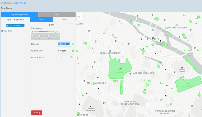
The style generation will create 2 layers:
- A
filllayer named{name}-fill - A
linelayer named{name}-outline
Create a new draft
After your datastyle is published, if you want to make changes you need to create a new draft version. By default, when you create a new draft, the latest version of the current datastyle is duplicated.
Alternatively, you can create a new draft version from the latest version of another datastyle:
- Click the Create draft from another style button
- Select the datastyle to copy
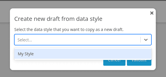
Note that you can only copy a latest version.
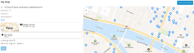
Map
Map is the last part of the pipeline. A map composes a basemap style and a datastyle to generate the final style that you will use in your application.
- Select a datastyle
- Select a basemap style
- Save & Publish
When selecting a datastyle you can choose to always follow the latest version. To enable it check the Always use latest published version box.
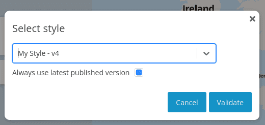
Click the Share and integrate button to see the different integration URLs.
Map version
The integration URLs are in the form /maps/{id}/versions/{version}. For the {version} path parameter you can use a number like 1 or the string latest.
Using latest allows your applications to always show the latest map version without modification.
Integration and dynamic behavior
The GIS manages the data and the style. However the dynamic behavior, e.g. when a user clicks on a point of interets, must be implemented on the client side. We recommend using the MapLibre libraries to display maps in your applications.
To help you with the integration, check out the following documentations and samples:
Glossary
Density reduction
When generating tiles, the tile service applies a grid-based density reduction algorithm for point geometries. For each cells of a given zoom level, it limits the number of point geometries. This way, low zoom levels (e.g. 0) contains only a fraction of the data, thus avoiding map overload.
Geometry simplification
To render features on a map efficiently at low zoom level, the tiling process simplifies large geometries (i.e. lines and polygons) using the Ramer–Douglas–Peucker algorithm.
MapLibre
MapLibre is a community-governed collection of open source mapping libraries:
- maplibre-gl-js for web
- maplibre-gl-native for Android and iOS
Overzooming
When the style max zoom is greater than the underlying data max zoom, the client map library continues to display the feature until the style max zoom.
For instance, your data max zoom might be equal 14 while your style max zoom is equal to 22. With this configuration, the client map library will render features up to zoom 22 using the vector tiles of zoom 14.
The benefit is that you can save space and time at runtime when the server generates the tileset. However make sure that the precision of the data max zoom is high enough otherwise you might not see all your data due to geometry simplification and density reduction.
Tileset
A tileset is a collection of vector tiles.
Vector style
A vector style describes how geospatial features should be rendered on a map. The GIS API generates MapLibre vector styles.
Vector tile
A vector tile is a lightweight data format for storing geospatial vector data, such as points, lines, and polygons. Vector tiles are used to partition geospatial features allowing them to be rendered efficiently on a map. You can find the specification here https://github.com/mapbox/vector-tile-spec.
Examples
- simple-map: Integrate your Jawg GIS map with MapLibre GL JS
- category-filter: Create category filtering using metadata
- cluster-air-quality: Use GIS clustered data in your map
- polygon-styling: Jawg GIS data with custom style